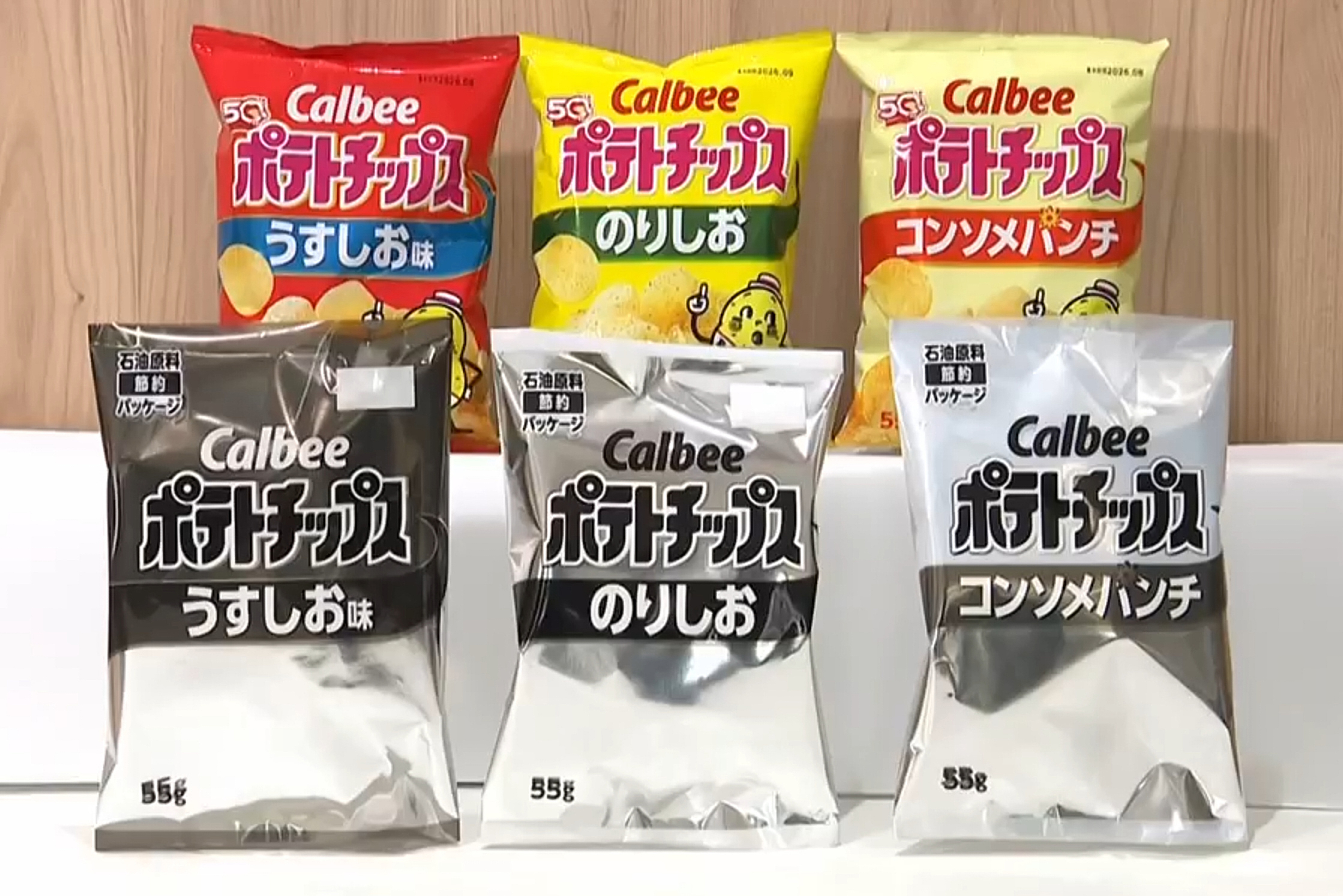
The transition from vibrant, high-saturation snack packaging to minimalist or "drained" aesthetic profiles is not a stylistic choice; it is a calculated response to a tightening intersection of global supply chain volatility, environmental regulatory pressure, and the diminishing marginal utility of premium printing techniques. When consumers observe a sudden lack of color on their potato chip packets, they are seeing the tangible result of a massive operational pivot toward ink reduction and substrate simplification. This shift is driven by three primary structural forces: the rising cost of solvent-based pigments, the engineering requirements of mono-material recycling, and the logistical necessity of maximizing printing press throughput.
The Tri-Component Pressure Model
To understand why a brand would intentionally "dull" its visual identity, one must examine the cost-benefit analysis of modern flexible packaging. The traditional multilayered laminate structure used for chips is becoming an environmental and financial liability.
1. The Pigment Scarcity and Cost Function
Ink constitutes a significant percentage of the variable cost in high-volume packaging. High-saturation colors, specifically metallics and deep primaries like "Lay’s Yellow" or "Doritos Red," require complex chemical formulations. The price of organic pigments and the solvents required to carry them (such as ethyl acetate) has experienced significant volatility due to disruptions in petrochemical refining. By reducing the "ink load"—the total volume of ink applied per square meter of film—manufacturers realize immediate savings on raw material inputs.
2. The Recyclability Constraint
Most chip packets are "multilayers," consisting of biaxially-oriented polypropylene (BOPP), a metallized layer for oxygen barrier, and various polyethylene resins. These are notoriously difficult to recycle. The industry is moving toward "mono-material" structures to comply with Extended Producer Responsibility (EPR) laws. However, high ink density interferes with the mechanical recycling process. When these plastics are melted down, heavy ink loads contaminate the resulting resin, turning it a muddy grey and reducing its tensile strength. Reducing color saturation is a prerequisite for creating a circular packaging economy where the output resin remains commercially viable.
3. The Digital Printing Bottleneck
Traditional rotogravure and flexographic printing are efficient for millions of identical units but lack the agility required for today’s hyper-segmented markets. As brands move toward more frequent "limited drops" or localized packaging, they are turning to digital inkjet printing. Digital presses have a narrower color gamut and higher per-unit ink costs than traditional methods. A design that uses 40% less ink allows these digital presses to run at higher speeds without saturating the substrate, effectively increasing the manufacturing facility's total output capacity.
The Mechanics of Ink Reduction Strategies
Manufacturers do not simply lower the opacity of their files. They employ specific technical maneuvers to maintain brand recognition while stripping out chemical volume.
- Screening and Halftoning Optimization: Instead of solid blocks of color, printers use sophisticated dithering patterns. This creates the illusion of a solid hue while leaving a significant portion of the base film untouched.
- Substrate Translucency: Some brands are experimenting with "windowed" packaging or translucent films that utilize the color of the product itself (the golden-brown of the chip) to provide the visual warmth previously provided by ink.
- The "Eco-Design" Psychological Hedge: By framing the loss of color as a "sustainability initiative," brands pivot a cost-saving measure into a brand-equity builder. This reclassifies a technical limitation as a deliberate ethical choice, shielding the company from consumer backlash regarding "cheaper" looking packaging.
The Barrier Technology Conflict
The primary functional requirement of a chip packet is the moisture and oxygen barrier. This is usually achieved through a vacuum-metallized aluminum layer. When a brand moves toward a "stripped-back" look, they often have to balance the visual loss with a technical upgrade. If a brand removes the opaque ink layer that protects the product from light-induced oxidation (rancidity), they must increase the UV-blocking properties of the clear film or the interior metallization.
This creates a hidden technical trade-off:
- Decreased Ink Volume: Leads to lower chemical costs and better recyclability.
- Increased Barrier Requirement: Leads to more expensive resin additives or thicker metallization layers.
The "drained" look is often the equilibrium point where the savings from ink reduction exceed the added costs of maintaining product shelf life through other means.
Logistical Throughput and the Drying Variable
High-speed printing presses are limited by the rate at which ink dries. Solvent-based inks require massive drying tunnels. If a design requires six layers of heavy ink, the press must run slower to ensure each layer is fully cured before the film is rolled. By stripping the color density, a facility can increase its line speed.
Consider an operation producing 50,000 units per hour. A 10% increase in line speed—made possible by a simpler, lower-ink design—results in an additional 40,000 units per eight-hour shift. In a low-margin, high-volume commodity business like salty snacks, the revenue generated by that extra volume far outweighs the aesthetic value of a high-gloss, deep-red packet.
Risk Assessment of Visual De-escalation
The strategy of draining color is not without risk. The primary danger is the "Genericization Trap."
The Loss of "Findability"
In retail environments, consumers rely on "system 1" thinking—fast, instinctive pattern recognition. A specific shade of blue signals "Salt & Vinegar" from thirty feet away. When the saturation is lowered or the color palette is neutralized, the cognitive load on the consumer increases. This creates a friction point that can lead to "brand switching" if the consumer cannot instantly locate their preferred product among a sea of similarly muted, "eco-friendly" packets.
The Perception of Quality Degradation
There is a psychological correlation between packaging density and perceived product freshness. Muted colors can inadvertently signal to the brain that the product inside is aged or "off." Brands must compensate for this by using high-contrast typography or "hero" photography of the product to reassure the consumer of the internal quality.
The Strategic Pivot for Manufacturers
Snack conglomerates are currently transitioning from "Marketing-First" packaging to "Operations-First" packaging. For decades, the package was a billboard. Today, it is a logistical unit that must comply with carbon-neutral targets and machine-learning-driven supply chain efficiencies.
To navigate this shift, firms must execute the following protocol:
- Conduct Ink-Load Audits: Identify non-critical visual elements that consume high-density pigments (e.g., solid background fills) and replace them with gradients or textured patterns that utilize the substrate’s natural color.
- Transition to Water-Based Systems: Prepare for the regulatory phase-out of high-VOC (Volatile Organic Compound) solvents. This transition usually requires a redesign of the brand's color palette, as water-based inks often cannot achieve the same "fluorescent" vibrance as solvent inks.
- Synchronize Design with EPR Requirements: Ensure that the reduction in ink is documented and marketed as a step toward 100% recyclability. This allows the brand to capture the "green premium" from consumers while simultaneously reducing the tax burden imposed by governments on non-recyclable plastic packaging.
The "bizarre" draining of color is, in reality, a sophisticated survival mechanism. It is the visual evidence of an industry attempting to decouple its growth from carbon-intensive chemical processes. The future of the supermarket aisle is not one of less color, but of "smarter" color—where every drop of pigment is justified by a rigorous intersection of shelf-impact and molecular-level recyclability.